Dashboard Layout
Dashboards are compositions of components used to provide navigation and present data. Below we’ll describe the components that are used to structure the navigation and layout of dashboards.
Navigation
All dashboards include a top-level navigation bar that provide a title and (optionally) a logo and author. Dashboards with multiple pages also contain a link to each page on the navigation bar:

The title and author are specified as they are with normal documents. You can also include a logo and one or more nav-buttons:
---
title: "Palmer Penguins"
author: "Cobblepot Analytics"
format:
  dashboard:
    logo: images/penguins.png
    nav-buttons: [linkedin, twitter, github]
---
The following special aliases are recognized for navigation buttons: linkedin, facebook, reddit, twitter, and github. You can also create custom buttons as described in Nav Items. For example:
format:
  dashboard:
    nav-buttons:
      - reddit
      - icon: gitlab
        href: https://gitlab.com/
Layout
Within a page, dashboard components are laid out using alternating sets of rows and columns. Rows and columns are in turn defined by markdown headings and computational cells. For example, here’s a simple layout with two rows, where the second row is split into two columns:
---
title: "Palmer Penguins"
author: "Cobblepot Analytics"
format: dashboard
---

## Row {height=70%}

```{python}
```

## Row {height=30%}

```{python}
```

```{python}
```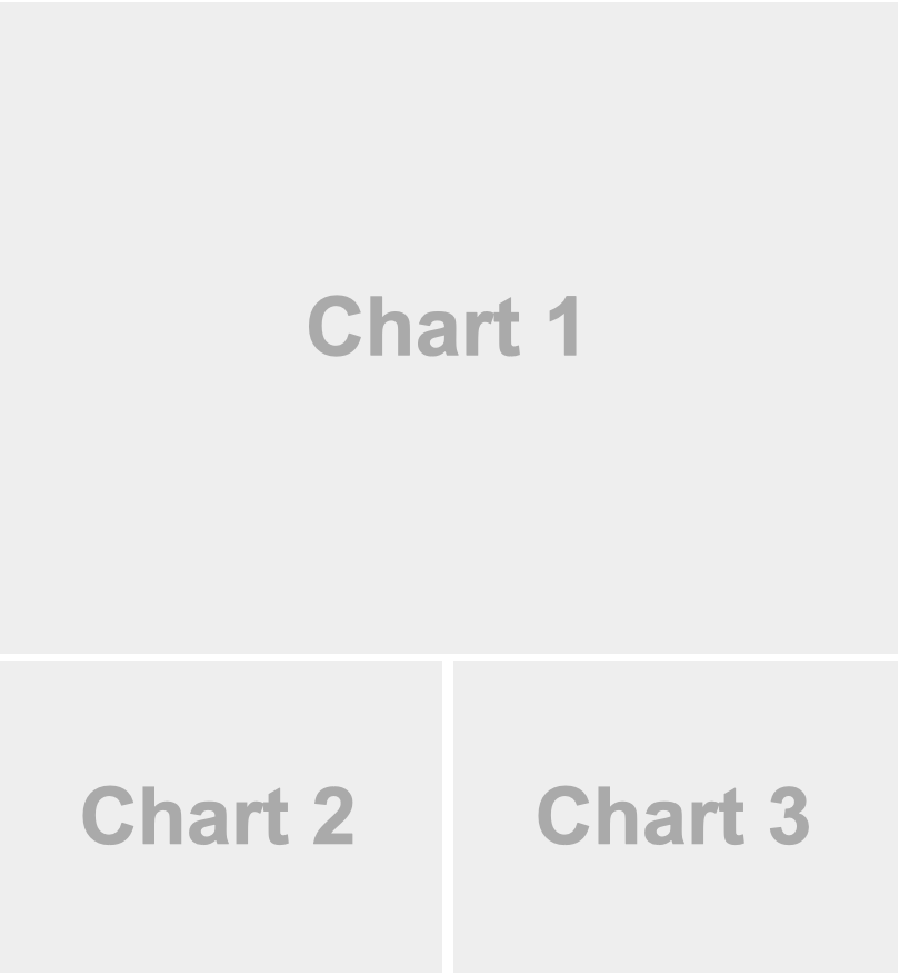
Here, level 2 markdown headings (e.g. ## Row {height=70%}) define the contents of rows as well as their relative height. The ```{python} code cells in turn automatically create cards that are laid out in columns within the row.
Although markdown headings are used to define the layout of rows and columns in Quarto dashboards, the heading text itself is discarded. We use the headings Row and Column in these docs to aid understanding of the layouts, but you can use more descriptive headings if they help you navigate your source code.
Orientation
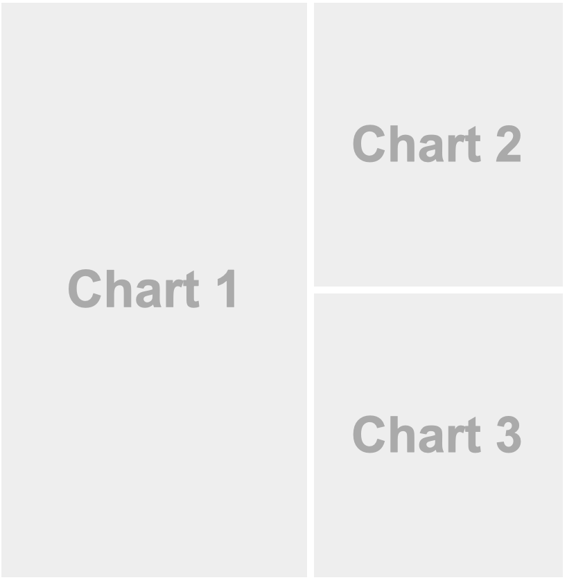
By default, dashboard pages are laid out first by row, then by column. However, you can change this by specifying the orientation: columns document option:
---
title: "Diamonds Explorer"
format:
  dashboard:
    orientation: columns
---

## Column {width=60%}

```{python}
```

## Column {width=40%}

```{python}
```

```{python}
```
Fill vs. Flow
Each row in your dashboard that is not given an explicit height will determine its size by either filling available space or by flowing to its natural height. Filling layout is generally the default, however for certain types of content (e.g. markdown text) flow layout is the default.
If the default behavior isn’t what you want, you can explicitly specify filling or flowing behavior using the .fill and .flow classes applied to a row. For example:
## Row {.fill}

## Row {.flow}
Scrolling
By default, dashboard content fills all available space in the page. You can alternatively specify the scrolling: true option to layout content using its natural height and scroll to accommodate page overflow. For example:
---
title: "Scrolling"
format:
  dashboard:
    scrolling: true
---

```{python}
```

```{python}
```

```{python}
```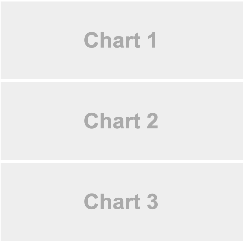
Because of its ability to scroll this layout could easily accommodate many more charts. While this is useful, you might also consider Pages and Tabsets (described in the next two sections) as alternate ways to present content within layouts that fill their page.
Pages
The layout examples above demonstrated only single-page dashboards. To introduce multiple pages, use level 1 headings above the level 2 headings used to define rows and columns. The text of the level 1 headings will be used to link to the pages in the navigation bar. For example, here is a dashboard that splits content across two pages:
---
title: "Palmer Penguins"
format: dashboard
---

# Bills

```{python}
```

# Flippers {orientation="columns" scrolling="true"}

## Column

```{python}
```

```{python}
```

## Column

```{python}
```
Note that we can set a per-page orientation by adding an orientation attribute to the page heading (here orientation="columns" for the second page). In addition, you can control per-page scrolling behavior using a scrolling attribute on the page heading (shown using scrolling="true" for the second page above).
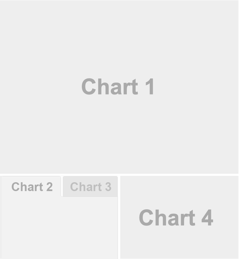
Tabsets
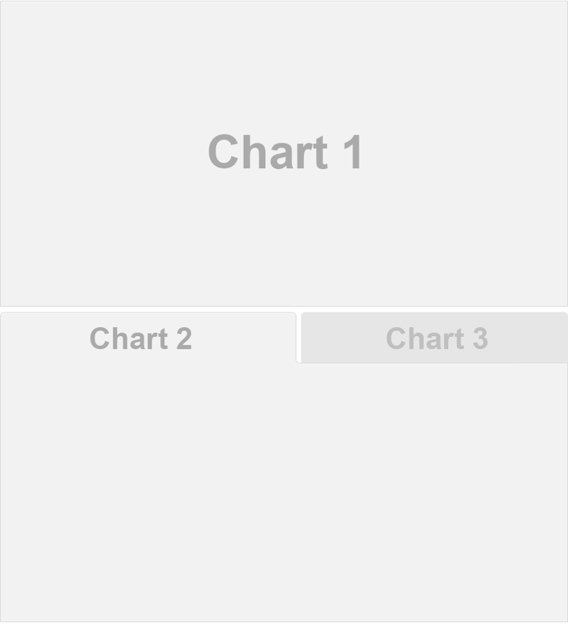
Use tabsets to include multiple views of data or to include content of secondary importance without having it crowd the main display. Tabsets are created by adding the .tabset class to a row or column. For example, this layout displays the bottom row as a set of two tabs.
---
title: "Palmer Penguins"
format: dashboard
---

## Row

```{python}
```

## Row {.tabset}

```{python}
#| title: Chart 2
```

```{python}
#| title: Chart 3
```
You can include tabsets at arbitrarily deep levels. Here we include a tabset within a column of a top level row:
---
title: "Palmer Penguins"
format: dashboard
---

## Row {height=70%}

```{python}
```

## Row {height=30%}

### Column {.tabset}

```{python}
#| title: Chart 2
```

```{python}
#| title: Chart 3
```

### Column

```{python}
```
Each cell within the tabset column becomes a tab, and we provide navigational titles for our tabs by adding a title option to the cell used to produce each tab.
You can also have tabs that contain only markdown. To do this use a ::: {.card} div and include a title attribute for the tab:
::: {.card title="My Title"}
Card text
:::
In the examples above, each tab included a single card. If you want tabs to contain multiple cards, introduce another level of headings below the tabset row or column. For example:
---
title: "Palmer Penguins"
format: dashboard
---

## Row {.tabset}

### Plots

```{python}
```

```{python}
```

### Data

```{python}
```
Cards
Cards are the fundamental unit of display within dashboards. Cards are created automatically for cells and markdown content that are within rows and columns. So for example, each of the Python cells here become cards:
## Column {width=40%}

```{python}
```

```{python}
```
You can also create cards that contain arbitrary markdown via a .card div. For example:
## Column {width=40%}

```{python}
```

::: {.card}
This text will be displayed within a card
:::

```{python}
```
To provide a title for a markdown card use the title attribute. For example:
::: {.card title="My Title"}
This text will be displayed within a card
:::
Note that if you are authoring within a Jupyter Notebook then markdown cells automatically become .card divs.
For additional details on how cells and their content are mapped to cards (e.g. excluding cells, cells with multiple outputs, etc.), see Cell Output.
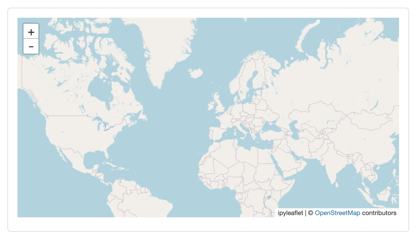
Display Options
By default, cards are displayed with no title and a small bit of padding around the edges. Here is a card that displays a Leaflet map:
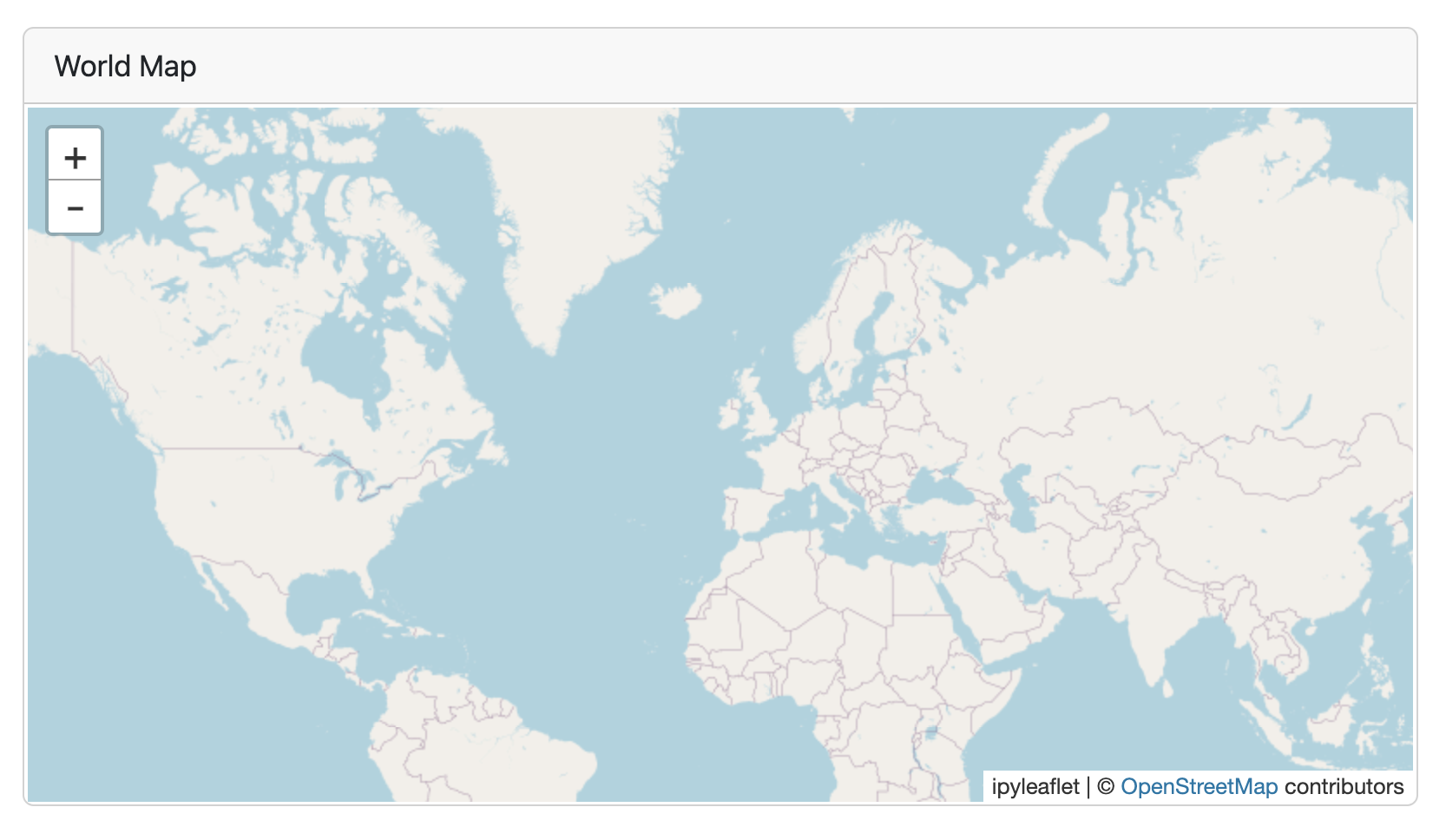
You can add a title to a card by including the title cell option. You can also customize the padding using the padding option. For example, here we add a title and remove the padding entirely:
```{python}
#| title: "World Map"
#| padding: 0px
from ipyleaflet import Map, basemaps, basemap_to_tiles
Map(basemap=basemap_to_tiles(basemaps.OpenStreetMap.Mapnik),
    center=(48.204793, 350.121558), zoom=2)
```
You can create a dynamic title by printing a title= expression as a cell’s first output. For example:
```{python}
from ipyleaflet import Map, basemaps, basemap_to_tiles

lat = 48
long = 350

print("title=", f"World Map at {lat}, {long}")

Map(basemap=basemap_to_tiles(basemaps.OpenStreetMap.Mapnik),
    center=(lat, long), zoom=2)
```
```{r}
library(leaflet)
lat <- 48
long <- 350
cat("title=", "World Map at", lat, long)
leaflet() |> addTiles() |>
setView(long, lat, zoom = 2)
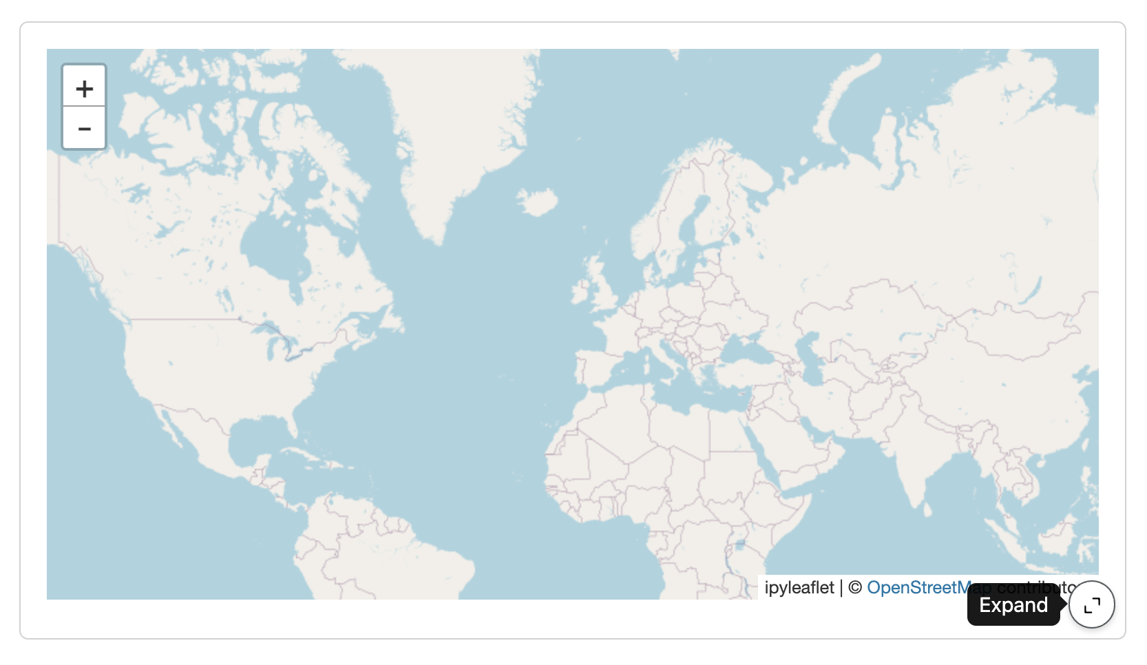
```Expanding Cards
By default, you can zoom in on the content of cards using the expand button in the bottom right:
If you don’t want cards to be expandable you can specify expandable: false (either at the document level or for individual cards).
Card Fill Behavior
Quarto inspects card contents and generally choose a fill behavior that best matches the contents of the card (by default cards will fill their container, though in specific cases like simple markdown the card will choose a flow layout). You can explicit control the fill behavior of card using the fill attribute with the desired boolean value. For example fill="false" will cause the card’s height to match the size of the content (not filling).
Learning More
Data Display shows you how to display data in your dashboard as plots, tables, value boxes, and text.
Inputs demonstrates various ways to layout inputs for interactive dashboards (sidebars, toolbars, attaching inputs directly to cards, etc.)
Examples provides a gallery of example dashboards you can use as inspiration for your own.
Theming describes the various way to customize the fonts, colors, layout and other aspects of dashboard appearance.
Parameters explains how to create dashboard variants by defining parameters and providing distinct values for them on the command line.
Deployment covers how to deploy both static dashboards (which require only a web host, but not a server) and Shiny dashboards (which require a Shiny Server).
Interactivity explores the various ways to create interactive dashboards that enable more flexible data exploration.