Dashboard Input Layout
Overview
There are several ways to layout inputs within interactive dashboards:
Sidebars provide a collapsible vertical panel for inputs.
Toolbars provide a horizontal panel for inputs.
Card Inputs provide a panel for card-specific inputs.
These techniques all create regions for inputs with a special background color to distinguish them from ordinary content. You can also locate inputs anywhere else you wish within a dashboard (i.e. in a standard card).
Sidebars
Sidebars are a great place to group inputs for dashboards. To include a sidebar, add the .sidebar class to a level 2 heading. For example:
---
title: "Sidebar"
format: dashboard
server: shiny
---

## {.sidebar}

```{python}
```

## Column

```{python}
```

```{python}
```
Here’s how a sidebar would appear (note there is a button in the top right that enables the user to optionally close the sidebar):
Inline Sidebar
While sidebars are often laid out at the page level (i.e. spanning the dashboard from top to bottom) you can actually include them anywhere within a layout. For example, here we have a sidebar that is within a row (rather than spanning all rows):
---
title: "Palmer Penguins"
format: dashboard
server: shiny
---

## Row

### {.sidebar}

```{python}
```

### Column

```{python}
```

## Row

```{python}
```
Location and Size
Sidebars can be located on either the left or right side. Layout a sidebar on the right by including it after the column(s) it is adjacent to. You can also modify the size of sidebars using the width attribute. This example demonstrates both of these techniques:
---
title: "Sidebar"
format: dashboard
server: shiny
---

## Column

```{python}
```

```{python}
```

## {.sidebar width="300px"}

```{python}
```
Toolbars
Toolbars are similar to sidebars, but provide a horizontal layout. Create a toolbar by adding the .toolbar class to a level 2 row heading. For example:
---
title: "Toolbar"
format: dashboard
server: shiny
---

## {.toolbar}

```{python}
```

## Row

```{python}
```
Global Toolbar
If you have a dashboard with multiple pages, you may want the toolbar to be global (i.e. visible across all pages). To do this, add the .toolbar class to a level 1 heading:
---
title: "Toolbar"
format: dashboard
server: shiny
---

# {.toolbar}

Toolbar content

# Page 1

```{python}
```

# Page 2

```{python}
```
Inline Toolbar
While toolbars are often laid out at the page level (i.e. spanning the dashboard from left to right) you can actually include them anywhere within a layout. For example, here we have a toolbar that is within a column (rather than spanning all columns):
---
title: "Palmer Penguins"
format:
  dashboard:
    orientation: columns
server: shiny
---

## Column

### {.toolbar}

```{python}
```

### Row

```{python}
```

## Column

```{python}
```
Location
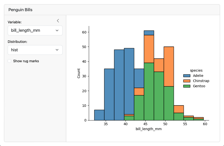
Toolbars can be located on either the top or bottom of content. Layout a toolbar on the bottom by including it after the rows(s) it is adjacent to. For example:
---
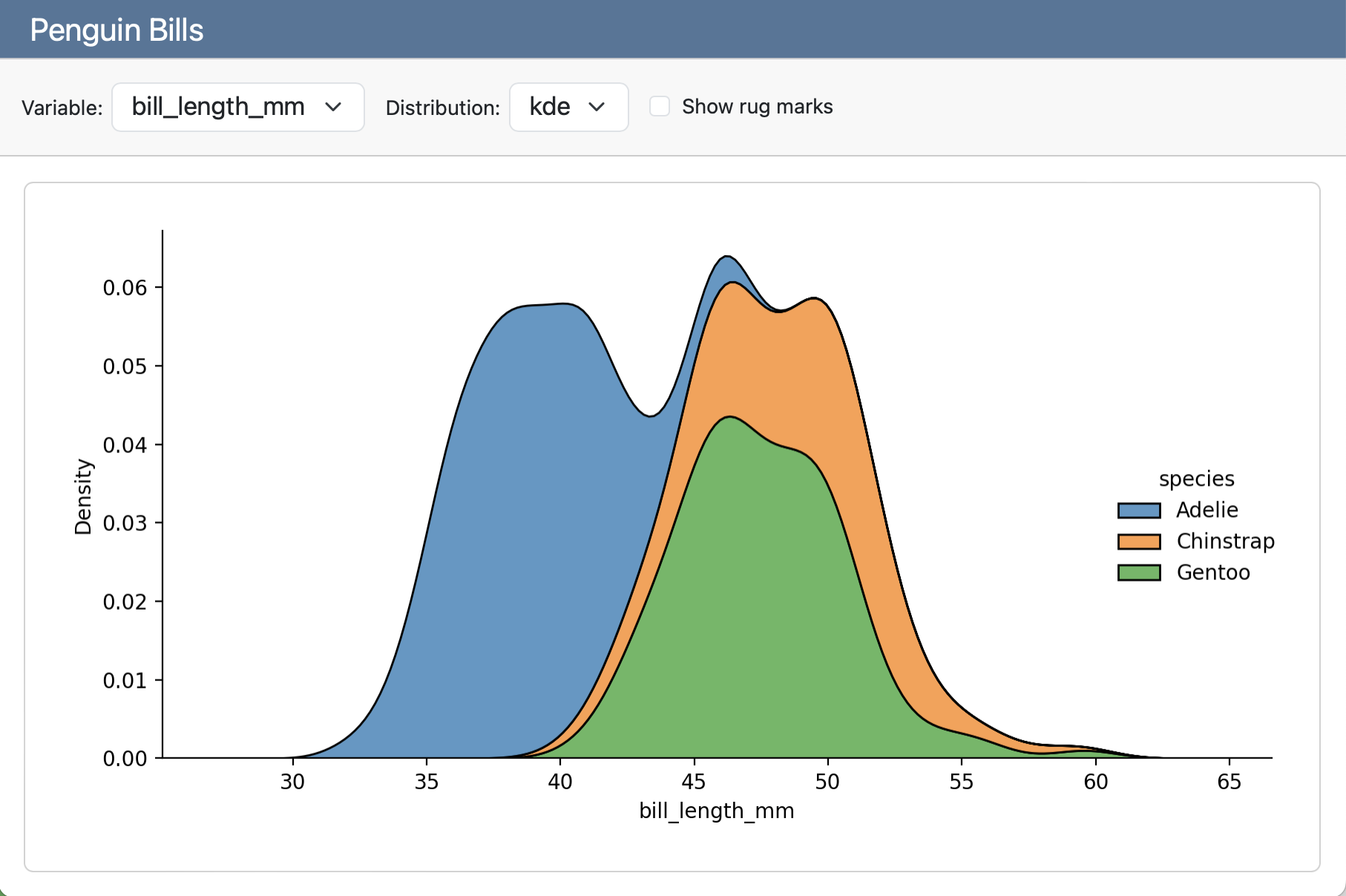
title: "Penguin Bills"
format: dashboard
server: shiny
---
## Row
```{python}
```
## {.toolbar}
```{python}
```
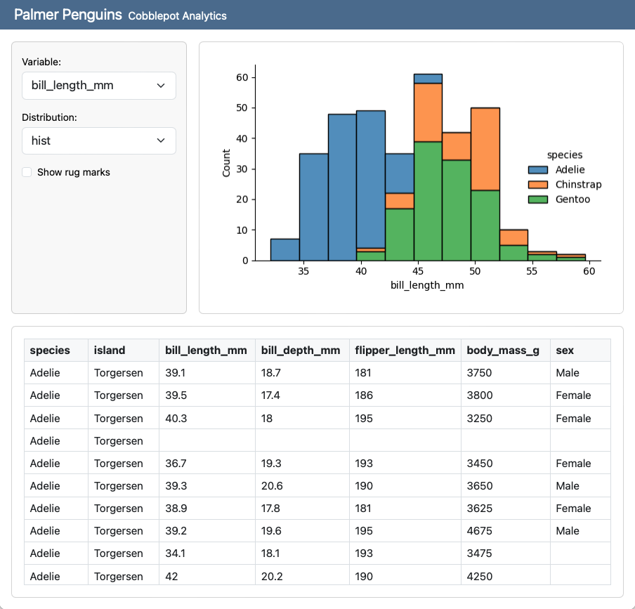
Card Inputs
In some cases you may want to connect inputs more directly to a single output. You can do this using either a card toolbar or card sidebar.
Card Toolbars
To add a toolbar to a card, define it immediately above or below the cell that generates the output. You can do this by either adding the content: card-toolbar option to a cell or by creating a div with the .card-toolbar class. For example:
```{python}
#| content: card-toolbar

```

```{python}
#| title: Penguin Bills

```
Note that the title attribute is optional for cells with toolbars (if there is no title then the inputs will be left rather than right aligned).
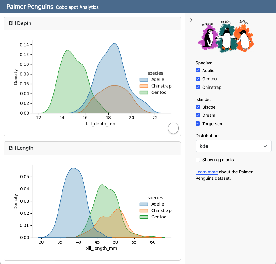
Card Sidebars
To add a sidebar to a card, define it immediately to the left or the right of the cell that generates the output. You can do this either by adding the content: card-sidebar option to a cell or by creating a div with the .card-sidebar class. For example:
```{python}
#| content: card-sidebar

```

```{python}
#| title: Penguin Bills

```