Dashboard Data Display
Dashboards are compositions of components used to provide navigation and present data. Below we’ll cover presenting data using plots, tables, and value boxes, as well how to include narrative content within dashboards.
Plots
Plots are by far the most common content type displayed in dashboards. Both interactive JavaScript-based plots (e.g. Altair and Plotly) and standard raster based plots (e.g. Matplotlib or ggplot2) are supported.
Below we provide some language specific tips and techniques for including plots within dashboards.
plotly
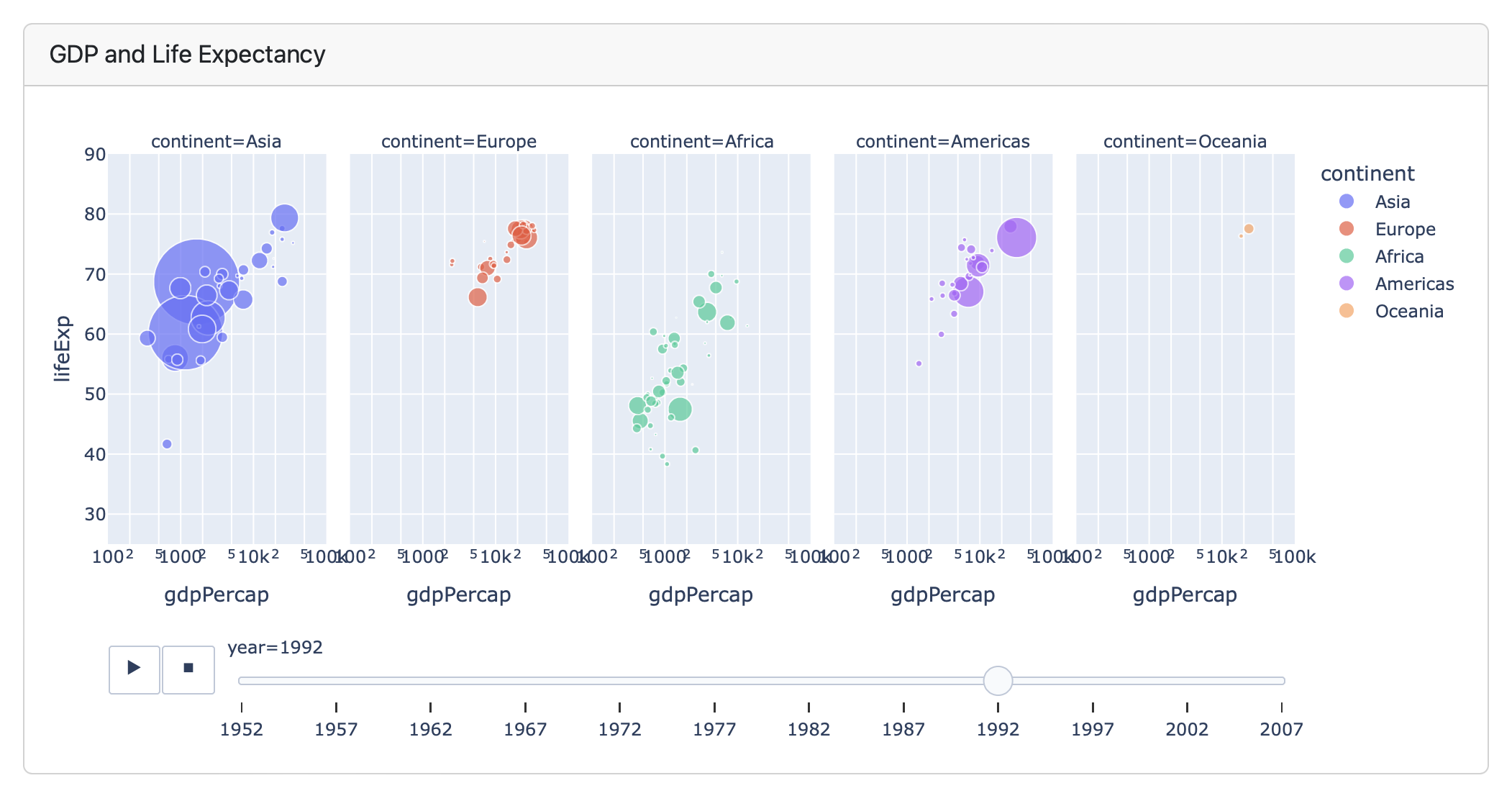
Plotly is a popular Python package for JavaScript based plots, and works very well in dashboard layouts. Plotly is also noteworthy because it includes many interactive features while still not requiring a server. For example, this plot supports an animated display of values changing over time:
```{python}
#| title: GDP and Life Expectancy
import plotly.express as px
df = px.data.gapminder()
px.scatter(
  df, x="gdpPercap", y="lifeExp",
  animation_frame="year", animation_group="country",
  size="pop", color="continent", hover_name="country",
  facet_col="continent", log_x=True, size_max=45,
  range_x=[100,100000], range_y=[25,90]
)
```
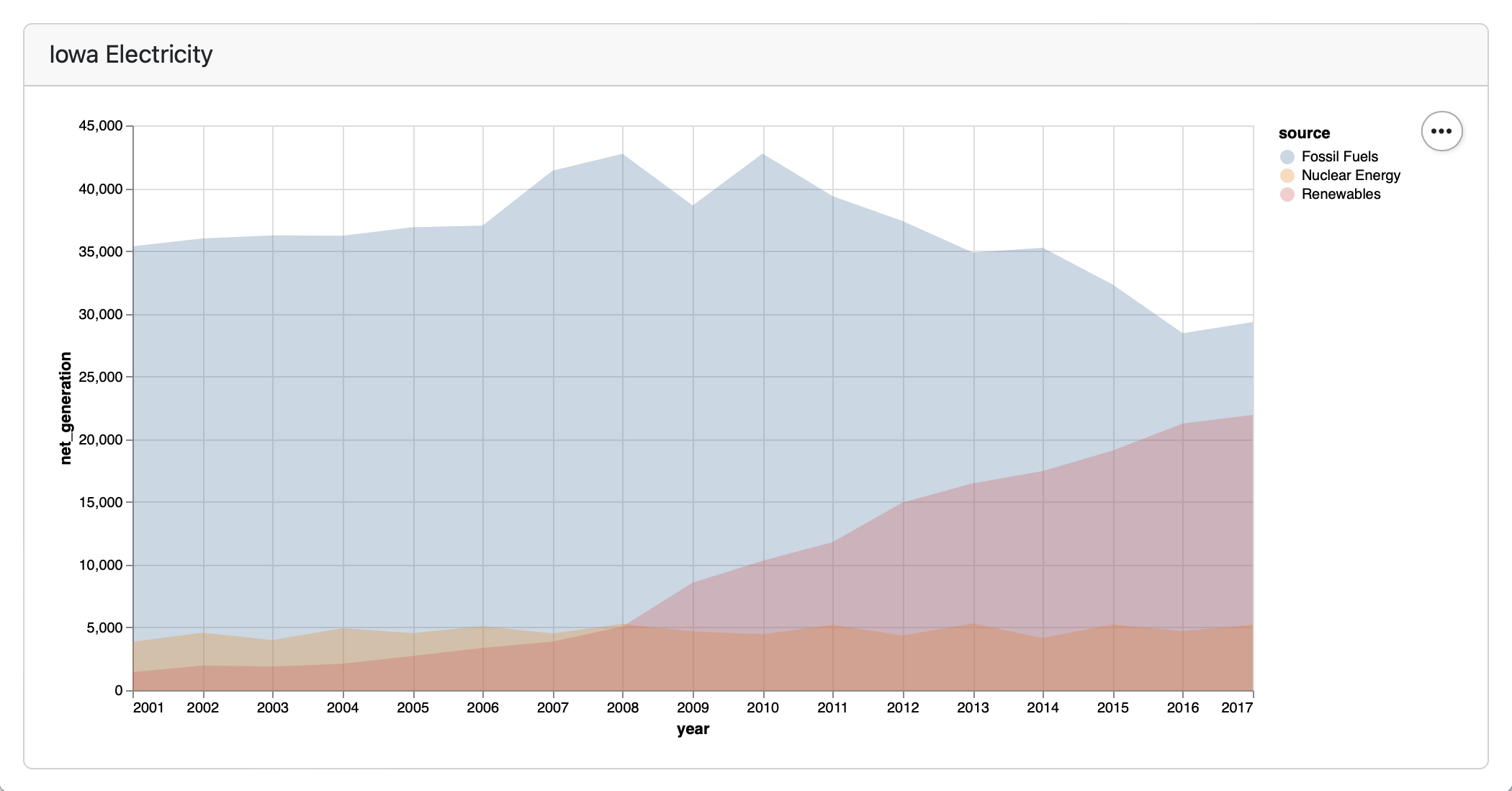
altair
Altair is a declarative statistical visualization library for Python based on Vega and Vega-Lite. Altair plots are JavaScript based so automatically resize themselves to fit their container within dashboards.
```{python}
#| title: Iowa Electricity
import altair as alt
from vega_datasets import data
source = data.iowa_electricity()
alt.Chart(source).mark_area(opacity=0.3).encode(
  x="year:T",
  y=alt.Y("net_generation:Q").stack(None),
  color="source:N"
)
```
matplotlib
If you are using traditional plotting libraries within static dashboards, you’ll need to pay a bit more attention to getting the size of plots right for the layout they’ll be viewed in. Note that this is not a concern for plots in interactive Shiny dashboards since all plot types are resized dynamically by Shiny.
If you are using Matplotlib (or libraries built on it like Seaborn) then you can set plot sizes using the figure.figsize global option (or alternatively per-figure if that’s more convenient):
```{python}
import matplotlib.pyplot as plt
plt.rcParams['figure.figsize'] = (12, 3)
```
In the case that your plots are laid out at a wider aspect ratio, setting this option can make a huge difference in terms of using available space. For example, the top plot in the stack below uses the default figure size of 8 x 5 and the bottom one uses the 12 x 3 ratio specified above:
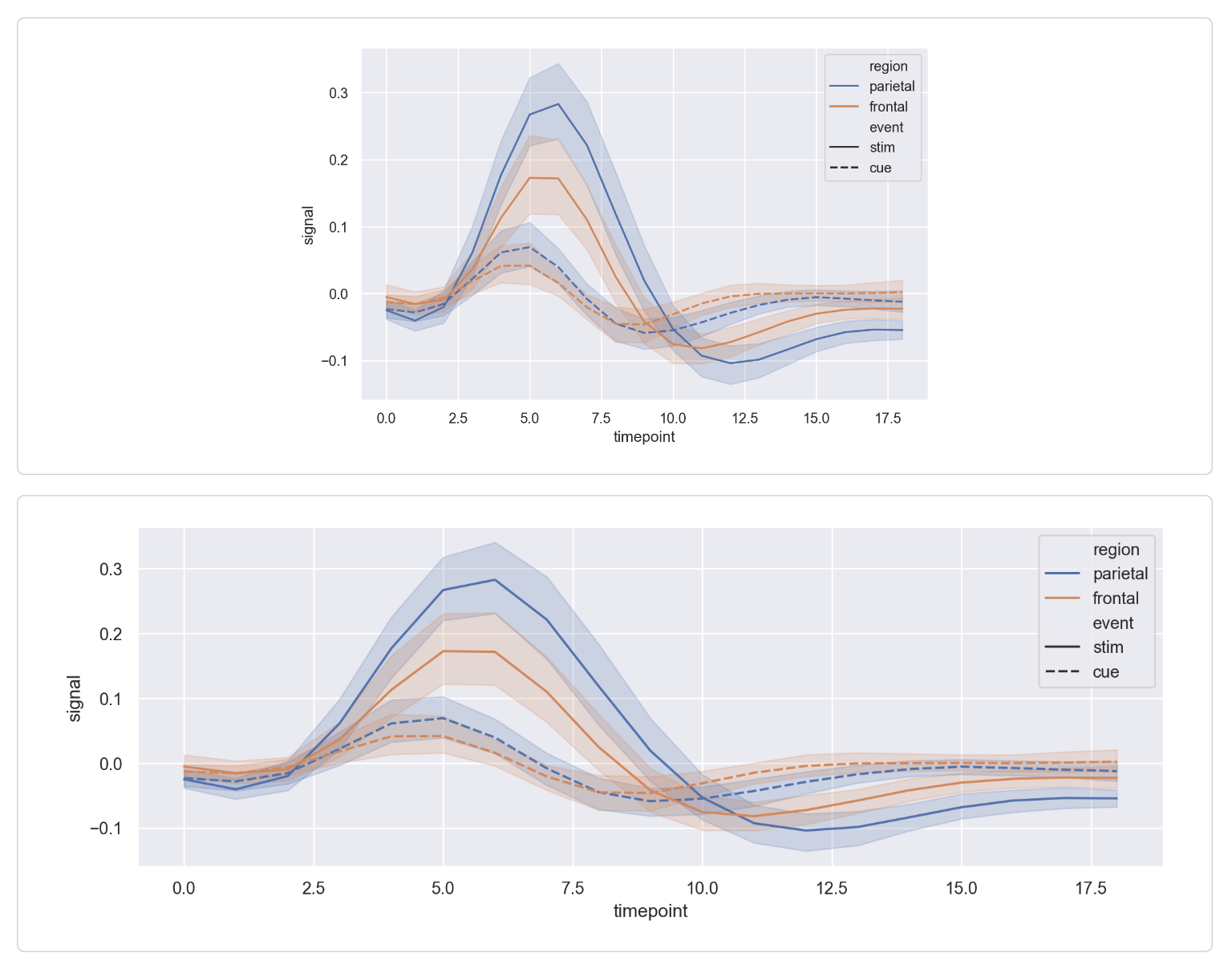
Note that the need to explicitly size plots is confined to traditional plotting libraries—if you use Plotly or another JavaScript based plotting system plots will automatically resize to fill their container.
htmlwidgets
The htmlwidgets framework provides high-level R bindings for JavaScript data visualization libraries. Some popular htmlwidgets include Plotly, Leaflet, and dygraphs.
You can use htmlwidgets just like you use normal R plots. For example, here is how we embed a Leaflet map:
```{r}
library(leaflet)
leaflet() %>%
  addTiles() %>%
  addMarkers(lng=174.768, lat=-36.852,
             popup="The birthplace of R")
```
There are dozens of packages on CRAN that provide htmlwidgets. You can find example uses of several of the more popular htmlwidgets in the htmlwidgets showcase and browse all available widgets in the gallery.
R Graphics
You can use any chart created with standard R raster graphics (base, lattice, grid, etc.) within dashboards. When using standard R graphics with static dashboards, you’ll need to pay a bit more attention to getting the size of plots right for the layout they’ll be viewed in. Note that this is not a concern for plots in interactive Shiny dashboards since all plot types are resized dynamically by Shiny.
The key to good sizing behavior in static dashboards is to define knitr fig-width and fig-height options that enable the plots to fit into their layout container as closely as possible.
Here’s an example of a layout that includes 3 charts from R base graphics:
## Row {height="65%"}

```{r}
#| fig-width: 10
#| fig-height: 8
plot(cars)
```

## Row {height="35%"}

```{r}
#| fig-width: 5
#| fig-height: 4
plot(pressure)
```

```{r}
#| fig-width: 5
#| fig-height: 4
plot(airmiles)
```
We’ve specified an explicit fig-height and fig-width for each plot so that their rendered size fits their layout container as closely as possible. Note that the ideal values for these dimensions typically need to be determined by experimentation.
For static dashboards, there are pros and cons to using JavaScript-based plots. While JavaScript-based plots handle resizing to fill their container better than static plots, they also embed the underlying data directly in the published page (one copy of the dataset per plot), which can lead to slower load times.
For interactive Shiny dashboards, all plot types are sized dynamically, so resizing behavior is not a concern as it is with static dashboards.
Tables
You can include data tables within dashboards in one of two ways:
- As a simple tabular display.
- As an interactive widget that includes sorting and filtering.
Below we provide some language specific tips and techniques for including tables within dashboards.
There are many Python packages available for producing tabular output. We’ll cover two of the more popular libraries (itables and tabulate) below.
itables
The Python itables package supports creating interactive data tables from Pandas and Polars DataFrames that you can sort and filter.
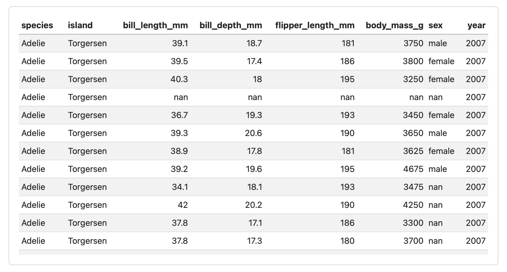
Use the show() method from itables to display an interactive table:
```{python}
from itables import show
show(penguins)
```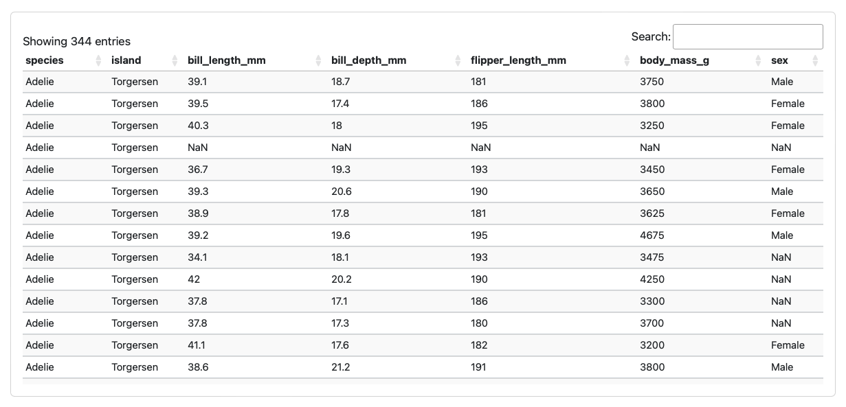
Options
Note that a few itables options are set automatically within dashboards to ensure that they display well in cards of varying sizes. The option defaults are:
from itables import options
options.dom = 'fiBrtlp'
options.maxBytes = 1024 * 1024
options.language = dict(info = "Showing _TOTAL_ entries")
options.classes = "display nowrap compact"
options.paging = False
options.searching = True
options.ordering = True
options.info = True
options.lengthChange = False
options.autoWidth = False
options.responsive = True
options.keys = True
options.buttons = []
You can specify alternate options as you like to override these defaults. Options can be specified in the call to show() or globally as illustrated above. Here’s an example of specifying an option with show():
show(penguins, searching = False, ordering = False)You can find the reference for all of the DataTables options here: https://datatables.net/reference/option/. All base options are available, as well as the options for the following extensions (which are automatically included by Quarto):
- https://datatables.net/extensions/buttons/
- https://datatables.net/extensions/keytable/
- https://datatables.net/extensions/responsive/
For example, to enable the copy and export (excel/pdf) buttons in a call to show():
show(penguins, buttons = ['copy', 'excel', 'pdf'])Or alternatively, to enable these buttons for all tables:
from itables import options
options.buttons = ['copy', 'excel', 'pdf']
Downsampling
When a table is displayed, the table data is embedded in the dashboard output. To prevent dashboards from being too heavy to load for larger datasets, itables will display only a subset of the table—one that fits into maxBytes (1024kb by default).
If you wish, you can increase the value of maxBytes or even deactivate the limit (with maxBytes=0). For example, to set a limit of 200kb:
```{python}
show(penguins, maxBytes = 200 * 1024)
```
tabulate
The Python tabulate package supports creating markdown tables from Pandas data frames, NumPy arrays, and many other data types. You can generate a markdown table from any Pandas data frame via the to_markdown() method (being sure to wrap it as Markdown output using IPython):
```{python}
import pandas as pd
from IPython.display import Markdown
penguins = pd.read_csv("penguins.csv")
Markdown(penguins.to_markdown(index=False))
```
Note that the index = False parameter supresses the display of the row index. Here is a card containing output from tabulate:
You can also import tabulate directly and pass in the object to print directly:
```{python}
from tabulate import tabulate
Markdown(
  tabulate(penguins, showindex=False,
           headers=penguins.columns)
)
```
There are many R packages available for producing tabular output. We’ll cover two of the more popular approaches (kable and DT) below.
kable
Simple markdown tables are ideal for smaller numbers of records (i.e. 20-250 rows). Use the knitr::kable() function to output markdown tables:
```{r}
knitr::kable(mtcars)
```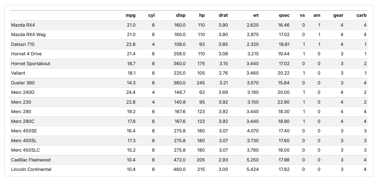
Simple markdown tables in dashboards automatically fill their container (scrolling horizontally and vertically as required).
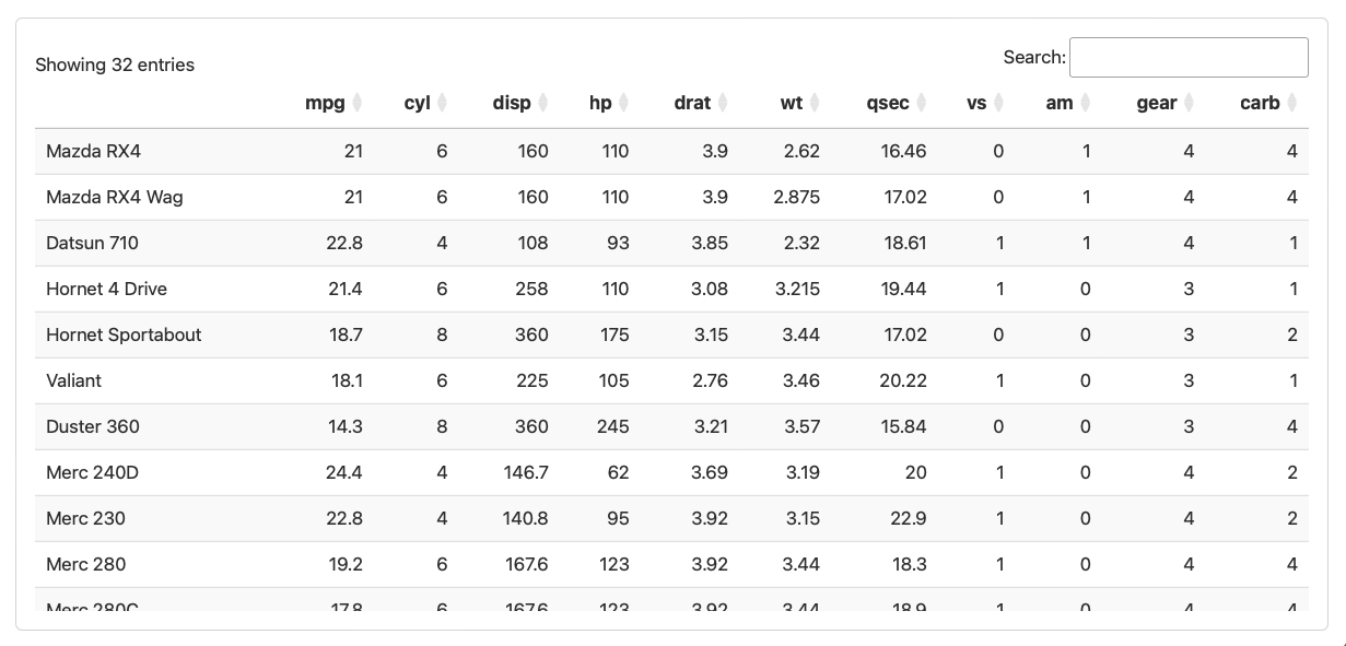
DT
The DT package (an interface to the DataTables JavaScript library) can display R matrices or data frames as interactive HTML tables that support filtering, pagination, and sorting.
To include a DataTable you use the DT::datatable function:
```{r}
library(DT)
datatable(mtcars)
```
Options
Note that a few DT options are set automatically within dashboards to ensure that they display well in cards of varying sizes. The option defaults are:
options(DT.options = list(
  bPaginate = FALSE,
  dom = "ifrt",
  language = list(info = "Showing _TOTAL_ entries")
))
You can specify alternate options as you like to override these defaults.
Value Boxes
Value boxes are a great way to prominently display simple values within a dashboard. For example, here is a dashboard row with three value boxes:
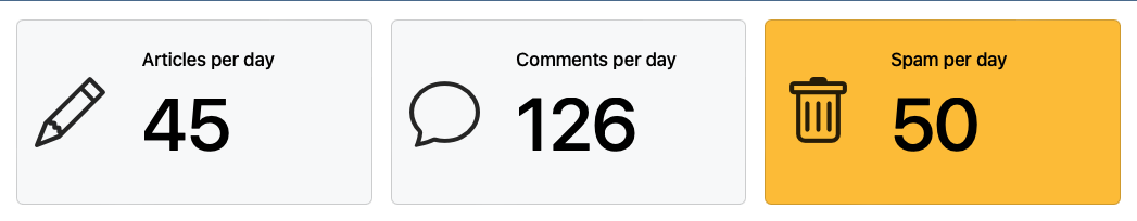
Here is the code you might use to create these value boxes. Note that we use a mix of Python and R cells in this example to illustrate the syntax for each language. Note also that we assume the variables articles, comments, and spam are computed previously within the document.
## Row

```{python}
#| content: valuebox
#| title: "Articles per day"
#| icon: pencil
#| color: primary
dict(
  value = articles
)
```

```{python}
#| content: valuebox
#| title: "Comments per day"
dict(
  icon = "chat",
  color = "primary",
  value = comments
)
```

```{r}
#| content: valuebox
#| title: "Spam per day"
list(
  icon = "trash",
  color = "danger",
  value = spam
)
```
You can choose between specifying value box options within YAML or within a dict() or list() (for Python and R, respectively) printed by the cell. The latter syntax is handy when you want the icon or color to be dynamic based on the value.
Icon and Color
The icon used in value boxes can be any of the 2,000 available bootstrap icons.
The color can be any CSS color value, however there are some color aliases that are tuned specifically for dashboards that you might consider using by default:
| Color Alias | Default Theme Color(s) |
|---|---|
primary |
Blue |
secondary |
Gray |
success |
Green |
info |
Bright Blue |
warning |
Yellow/Orange |
danger |
Red |
light |
Light Gray |
dark |
Black |
You can override these defaults by specifying value box Sass variables in a custom theme.
While the aliases apply to all themes, the colors they correspond to vary.
Shiny
In a Shiny interactive dashboard you can have value boxes that update dynamically based on the state of the application. The details on how to do this are language-specific:
Use the ui.value_box() function within a function decorated with @render.ui. For example:
```{python}
from shiny.express import render, ui
@render.ui
def value():
    return ui.value_box("Value", input.value())
```
Use the bslib::value_box() function along with an optional icon drawn from the bsicons package. For example:
```{r}
library(bslib)
library(bsicons)
value_box(
  title = "Value",
  value = textOutput("valuetext"),
  showcase = bs_icon("music-note-beamed")
)
```
Markdown Syntax
You can also create value boxes using plain markdown, in which case you’ll typically include the value via an inline expression. For example:
## Row

::: {.valuebox icon="pencil" color="blue"}
Articles per day

`{python} articles`
:::
Text Content
While you often fill dashboard cards with plots and tables, you can also include arbitrary markdown content anywhere within a dashboard.
Content Cards
Here is a dashboard where the last card in a column is plain markdown:
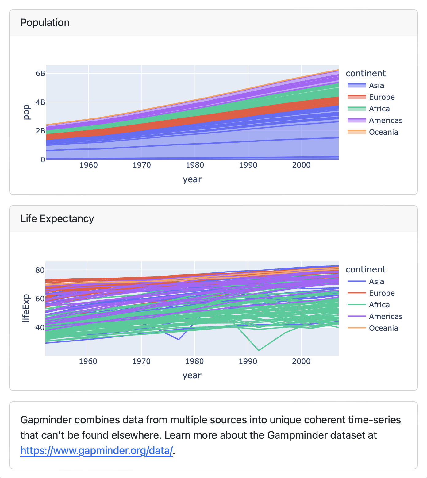
To do this just include a .card div alongside the other cells:
## Column

```{python}
#| title: Population
px.area(df, x="year", y="pop", color="continent",
        line_group="country")
```

```{python}
#| title: Life Expectancy
px.line(df, x="year", y="lifeExp", color="continent",
        line_group="country")
```

::: {.card}
Gapminder combines data from multiple sources into
unique coherent time-series that can’t be found
elsewhere. Learn more about the Gampminder dataset at
<https://www.gapminder.org/data/>.
:::
Note that if you are authoring using a Jupyter Notebook then markdown cells automatically become .card divs (i.e. they don’t need the explicit ::: div enclosure).
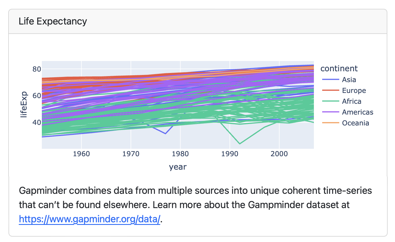
Content within Cells
To include content alongside the ouptut of a cell, just enclose the both the cell and the content in a .card div. For example:
::: {.card title="Life Expectancy"}

```{python}
px.line(df, x="year", y="lifeExp", color="continent",
        line_group="country")
```

Gapminder combines data from multiple sources into
unique coherent time-series that can’t be found
elsewhere. Learn more about the Gampminder dataset at
<https://www.gapminder.org/data/>.
:::
Leading Content
Content that is included at the very top of a dashboard (and not explicitly within a .card div) is considered leading content, and will be included as is with no card styling (e.g. with no border). For example:
---
title: "My Dashboard"
format: dashboard
---

This content will appear above all of the other
rows/columns, with no border.

## Row

```{python}
```
Dynamic Content
You can use inline expressions to make text content dynamic. For example, here we have a row with text content that makes use of Python expressions:
::: {.card}
The sample size was `{python} sample`. The mean reported
rating was `{python} rating`.
:::
Cell Output
The output of each computational cell within your notebook or source document will be contained within a Card. Below we describe some special rules observed when creating cards.
Dynamic Titles
You can create a dynamic title by printing a title= expression as a cell’s first output (in contrast to including the title as a YAML cell option). For example:
```{python}
from ipyleaflet import Map, basemaps, basemap_to_tiles

lat = 48
long = 350

print("title=", f"World Map at {lat}, {long}")

Map(basemap=basemap_to_tiles(basemaps.OpenStreetMap.Mapnik),
    center=(lat, long), zoom=2)
```
```{r}
library(leaflet)
lat <- 48
long <- 350
cat("title=", "World Map at", lat, long)
leaflet() |> addTiles() |>
setView(long, lat, zoom = 2)
```Excluded Cells
Cells that produce no output do not become cards (for example, cells used to import packages, load and filter data, etc). If a cell produces unexpected output that you want to exclude add the output: false option to the cell:
```{python}
#| output: false
# (code that produces unexpected output)
```
Expression Printing
By default, all output from top level expressions is displayed within dashboards. This means that multiple plots can easily be generated from a cell. For example:
```{python}
#| title: "Tipping Behavior"
px.box(df, x="sex", y="total_bill", color="smoker")
px.violin(df, x="sex", y="total_bill", color="smoker")
```
This behavior corresponds to the "all" setting for Jupyter shell interactivity. You can customize this behavior within Quarto using the ipynb-shell-interactivity option.
Card Layout
If a cell produces multiple outputs you can use cell layout options to organize their display. For example, here we modify the example to display plots side-by-side using the layout-ncol option:
```{python}
#| title: "Tipping Behavior"
#| layout-ncol: 2
px.box(df, x="sex", y="total_bill", color="smoker")
px.violin(df, x="sex", y="total_bill", color="smoker")
```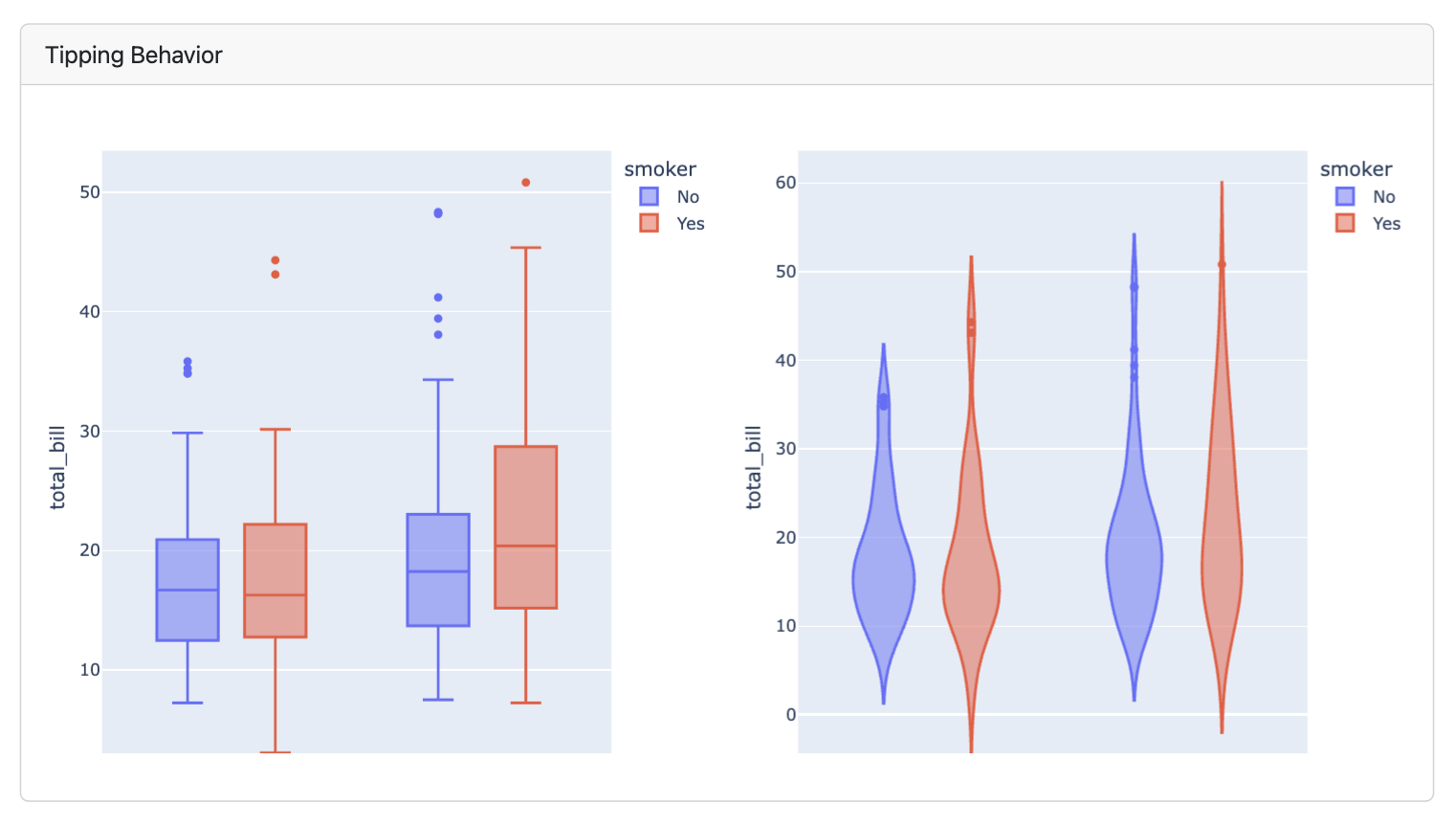
See the article on Figures for additional documentation on custom layouts.
Learning More
Layout shows you how to control the navigation bar, and how to arrange your content across pages, rows, columns, tabsets, and cards.
Inputs demonstrates various ways to layout inputs for interactive dashboards (sidebars, toolbars, attaching inputs directly to cards, etc.)
Examples provides a gallery of example dashboards you can use as inspiration for your own.
Theming describes the various way to customize the fonts, colors, layout and other aspects of dashboard appearance.
Parameters explains how to create dashboard variants by defining parameters and providing distinct values for them on the command line.
Deployment covers how to deploy both static dashboards (which require only a web host, but not a server) and Shiny dashboards (which require a Shiny Server).
Interactivity explores the various ways to create interactive dashboards that enable more flexible data exploration.