Quarto Dashboards
Overview
Quarto Dashboards make it easy to create interactive dashboards using Python, R, Julia, and Observable:
Publish a group of related data visualizations as a dashboard. Use a wide variety of components including Plotly, Leaflet, Jupyter Widgets, htmlwidgets; static graphics (Matplotlib, Seaborn, ggplot2, etc.); tabular data; value boxes; and text annotations.
Flexible and easy to specify row and column-based Layouts. Components are intelligently re-sized to fill the browser and adapted for display on mobile devices.
Author using any notebook editor (JupyterLab, etc.) or in plain text markdown with any text editor (VS Code, Positron, RStudio, Neovim, etc.)
Dashboards can be deployed as static web pages (no special server required) or you can optionally integrate a backend Shiny Server for enhanced interactivity.
Examples
You can create highly customized layouts and use a wide variety of dashboard themes as illustrated in these examples (click to see them in more detail):
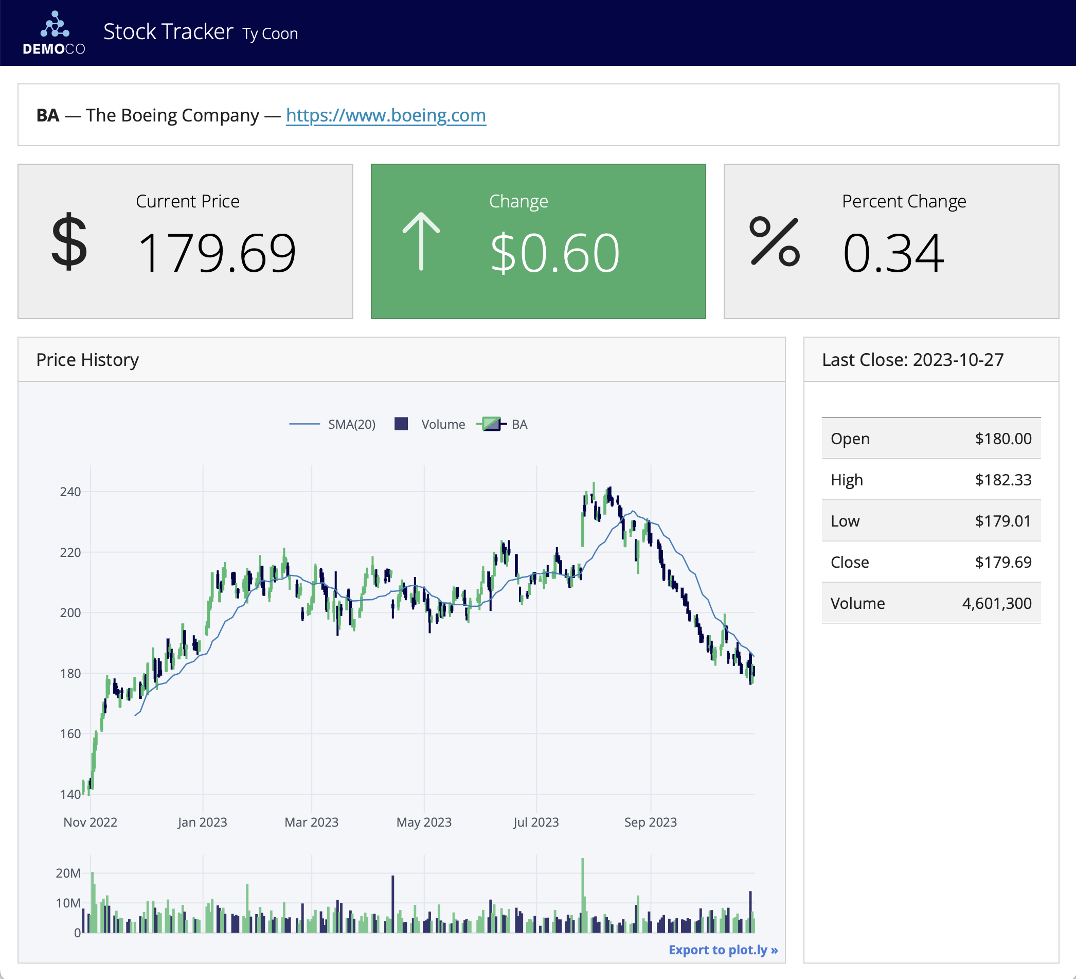
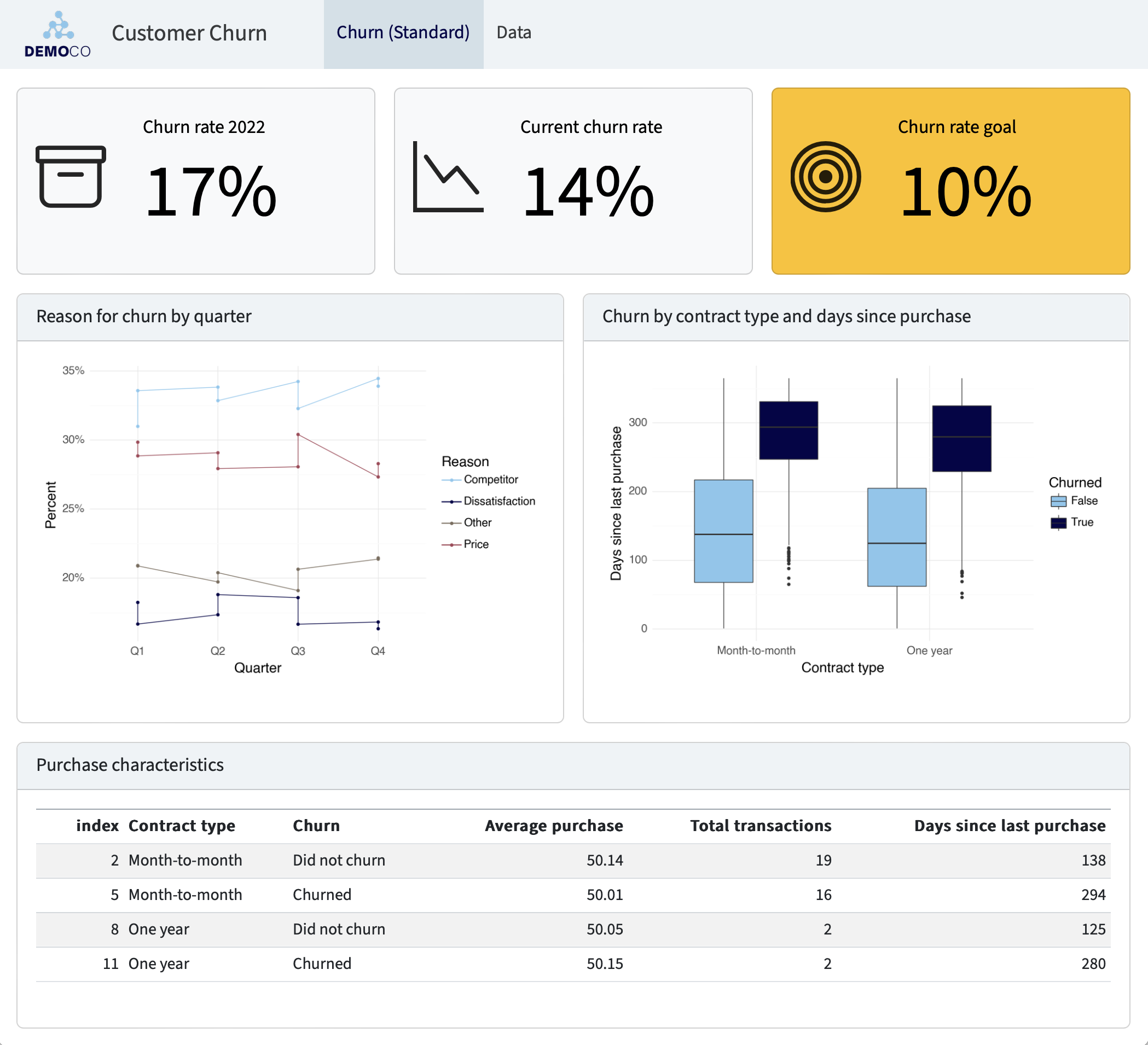
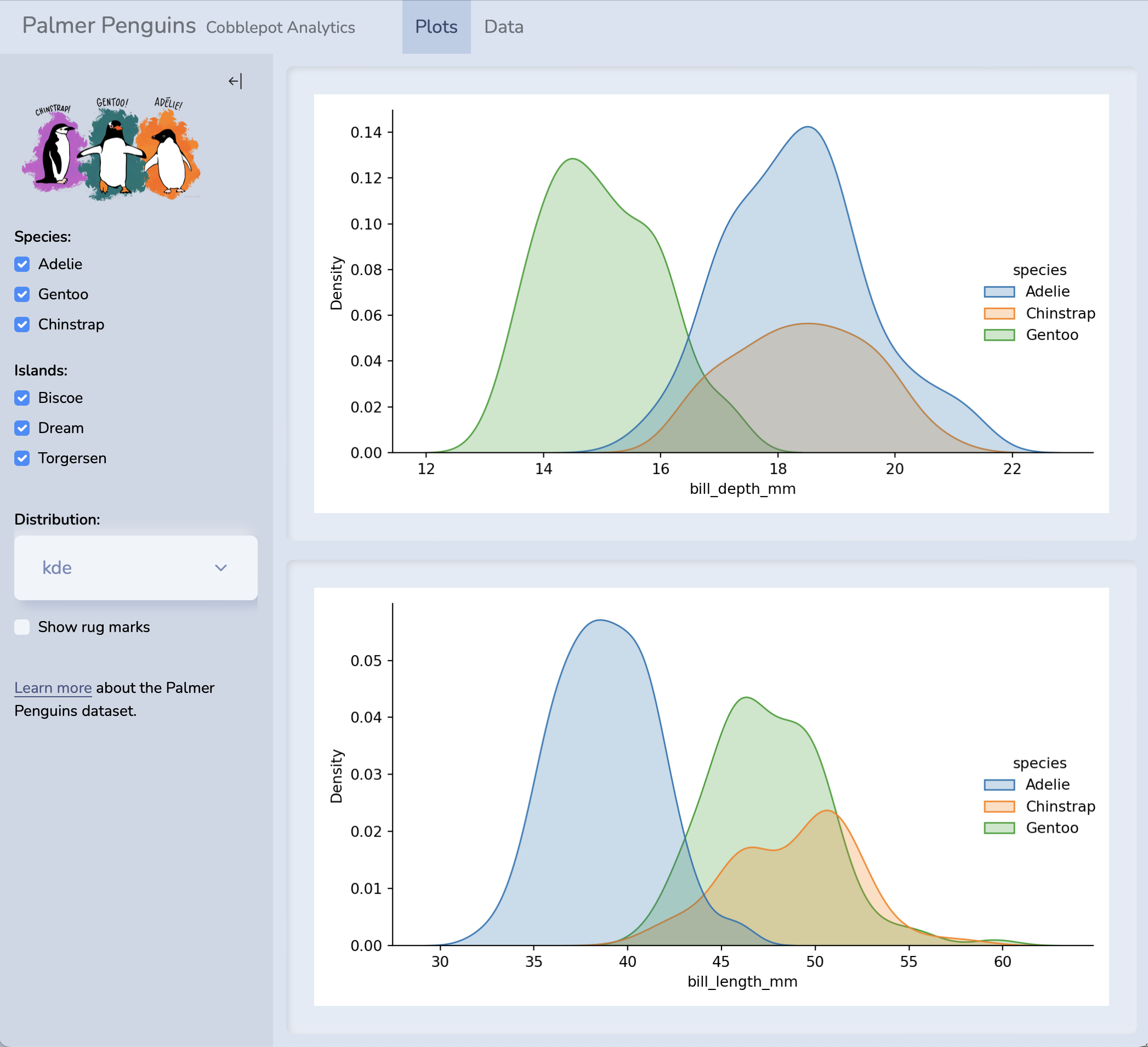
For live versions of these dashboards, source code, and additional examples see the dashboard section of the gallery.
Walkthrough
Here we’ll walk through a simple example to illustrate the basics. Then, we’ll provide detailed instructions on how to get started with building your own dashboards.
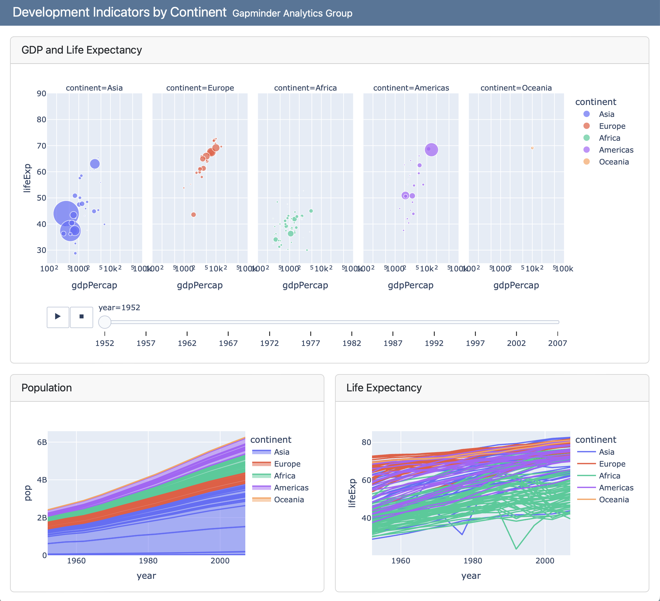
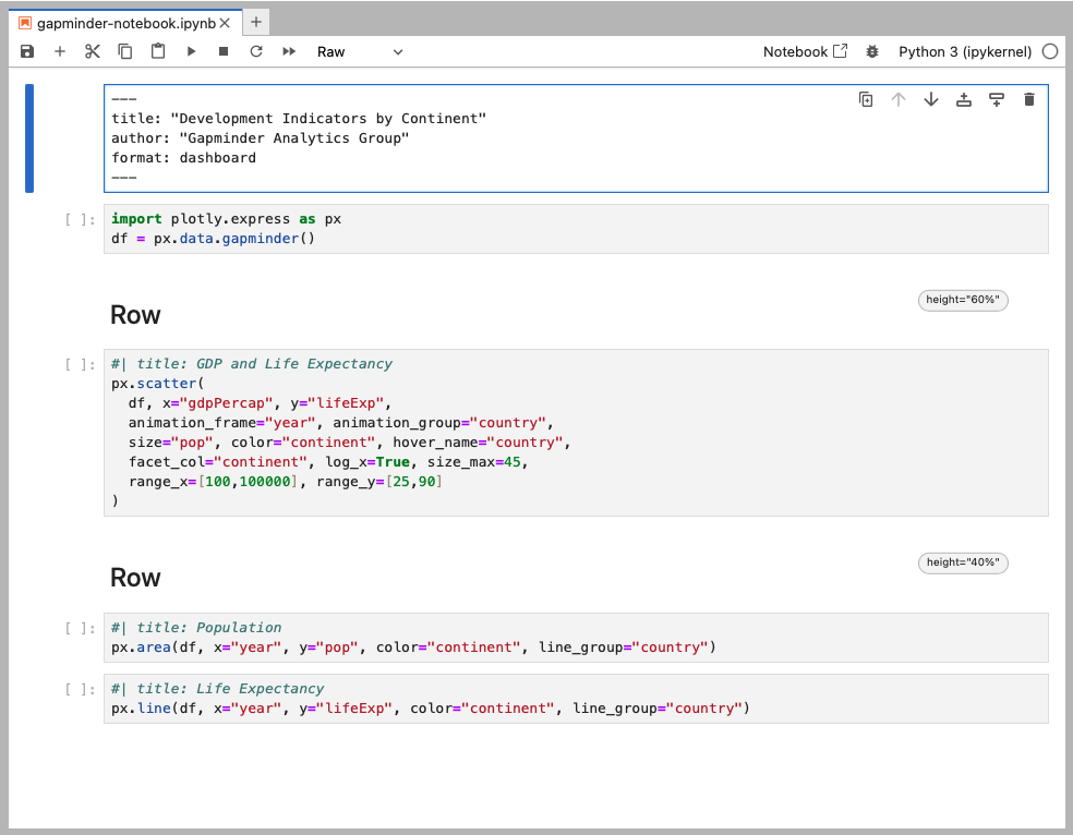
This simple single-page Python dashboard uses interactive Plotly visualizations to explore development indicators in the Gapminder dataset. The dashboard includes two rows, the second of which includes two columns:
Dashboards consist of several components:
Navigation Bar — Icon, title, and author along with links to sub-pages (if more than one page is defined).
Pages, Rows, Columns, and Tabsets — Pages, rows and columns are defined using markdown headings (with optional attributes to control height, width, etc.). Tabsets can be used to further divide content within a row or column.
Cards, Sidebars, and Toolbars — Cards are containers for plots, data display, and free form content. The content of cards typically maps to cells in your notebook or source document. Sidebars and toolbars are used to present inputs within interactive dashboards.
Dashboards can be created either using Jupyter notebooks (.ipynb) or using plain text markdown (.qmd). Here is the code for the notebook version of the above example (click the image for a zoomed view):
Here is the plain text .qmd version of the dashboard (click on the numbers on the far right for additional explanation of syntax and mechanics):
---
title: "Development Indicators by Continent"
author: "Gapminder Analytics Group"
format: dashboard
---
```{python}
import plotly.express as px
df = px.data.gapminder()
```
## Row {height=60%}
```{python}
#| title: GDP and Life Expectancy
px.scatter(
df, x="gdpPercap", y="lifeExp",
animation_frame="year", animation_group="country",
size="pop", color="continent", hover_name="country",
facet_col="continent", log_x=True, size_max=45,
range_x=[100,100000], range_y=[25,90]
)
```
## Row {height=40%}
```{python}
#| title: Population
px.area(
df, x="year", y="pop",
color="continent", line_group="country"
)
```
```{python}
#| title: Life Expectancy
px.line(
df, x="year", y="lifeExp",
color="continent", line_group="country"
)
```- 1
-
The document options define the
titleandauthorfor the navigation bar as well as specifying the use of thedashboardformat. - 2
-
Rows and columns are defined using headings. In this example we define two rows and specify their relative sizes using the
heightoption. - 3
-
Computational cells become cards that live within rows or columns. Cards can have an optional title (which here we specify using the
titleoption). - 4
- The second row includes two computational cells, which are automatically split into two side by side cards.
Getting Started
Step 1: Install Quarto
Dashboards are a feature in the Quarto v1.4. Before you get started, make sure you install the latest release version of Quarto.
Highlights
Quarto 1.9 includes the following new features:
Posit Connect Cloud Publishing: Publish documents and websites to Posit Connect Cloud using
quarto publish posit-connect-cloud.Output for LLMs: Generate
llms.txtand.llms.mdfiles for websites, making your content more accessible to large language models and AI-powered tools.quarto use brandcommand: Add or update brand assets from an external source.List Tables: Create complex tables with a list-like syntax. An easier-to-maintain alternative to grid tables, originally developed by Martin Fischer with contributions from Albert Krewinkel and William Lupton.
PDF Accessibility:
PDF Standards and Accessibility for LaTeX and Typst: New
pdf-standardoption enables PDF/A archival formats and PDF/UA accessibility compliance. Usequarto install verapdfto automatically validate compliance.Image alt text for PDF accessibility: Alt text
fig-altattributes now passes through to PDF output for screen reader support in both LaTeX and Typst formats.Alt text for cross-referenced equations in Typst: Provide descriptive text for equations using the
altattribute.
Improvements to Typst support:
Typst book projects: Book projects can now render to Typst via the bundled
orange-bookextension, providing chapter numbering, cross-references, and professional textbook styling.Support for Article layout: Place content in the margins, create full-width figures, or add side notes.
New options:
mathfont,codefont,linestretchlinkcolor,citecolor,filecolorthanksabstract-title
Theorem styling: New
theorem-appearanceoption with four styles:simple(classic LaTeX),fancy(colored boxes with brand colors),clouds(rounded backgrounds), orrainbow(colored borders and titles).
Privacy-focused features for websites:
A privacy-first default for cookie consent: The default for cookie consent has changed to
type: express, providing opt-in consent that blocks cookies until users explicitly agree. This privacy-conscious default is designed with modern privacy regulations in mind.Algolia Search Insights avoids cookies: Use Algolia Insights now uses persistent cookies only if
cookie-consentis active, and the user has opted-in.Use Plausible Analytics: Add privacy-friendly Plausible Analytics to websites via the
plausible-analyticsconfiguration option.
Search Result Highlighting: Improved highlighting of search terms on destination pages, with persistent marks, automatic tab activation for matches inside tabsets, and cross-element highlighting for multi-word searches.
aria-labelfor videos: Improve accessibility of embedded videos by providing custom descriptive labels for screen readers instead of the default “Video Player” label.New
syntax-highlightingOption: Replaces the deprecatedhighlight-style(Pandoc 3.8). Supports style names, custom.themefiles,none, oridiomaticfor format-native highlighting.Metadata and brand extensions now work without a
_quarto.ymlproject. A temporary default project is created in memory.Engine extensions allow replacement of the execution engine:
- Julia is now a bundled extension instead of being built-in.
- quarto-marimo will soon change from a filter extension to an engine extension.
- New
quarto create extension enginecommand. - New
quarto call build-ts-extensioncommand. - New Quarto API for engine extensions to use. (This is in flux and will not be documented for the next few releases, but there will be a dev blog post about it.)
Release Notes
You can find release notes and installers for all platforms in the download page.
Step 2: Learn the Basics
Start by learning how to lay out your dashboard and populate it with content:
Dashboard Layout shows you how to control the navigation bar, and how to arrange your content across pages, rows, columns, tabsets, and cards.
Data Display shows you how to display data in your dashboard as plots, tables, value boxes, and text.
Step 3: Explore Further
Once you’ve mastered the basics, check out these additional articles to learn more.
Examples provides a gallery of example dashboards you can use as inspiration for your own.
Inputs demonstrates various ways to layout inputs for interactive dashboards (sidebars, toolbars, attaching inputs directly to cards, etc.)
Theming describes the various way to customize the fonts, colors, layout and other aspects of dashboard appearance.
Parameters explains how to create dashboard variants by defining parameters and providing distinct values for them on the command line.
Deployment covers how to deploy both static dashboards (which require only a web host, but not a server) and Shiny dashboards (which require a Shiny Server).
Interactivity explores the various ways to create interactive dashboards that enable more flexible data exploration.